22.4.04
Gmail (beta) screenshots
The Gmail (beta) Inbox.
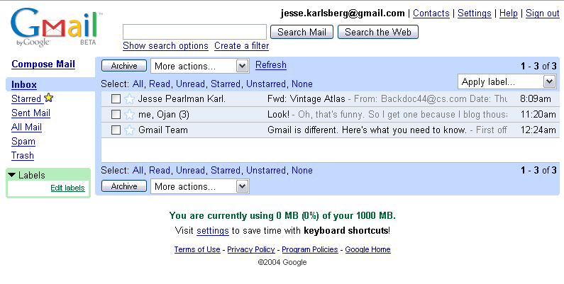
The interface is clean, fits in with Google's overall look and feel, and is much more airy and pleasant than the Yahoo! and Hotmail interfaces. You really get a lot of information in the inbox window: When an email is the latest in a thread of emails, you get a list of all the participants in the conversation, as in me, Ojan. You get the time the email was sent, the title of the email, whether the email is starred or labeled, and even the beginning of the email's text.
Other nice features include the wide range of quick selection options, and the ability to "archive" a message. This is Gmail's alternative to message deletion. While it isn't immediately apparent, it is possible to delete messages in Gmail. To do so, select move to trash from the drop-down menu next to "archive" and select the option to move the message to the trash. The default action there is to move a message back to your inbox, but from the drop down menu you can elect to delete the message "forever." While Gmail does offer you the option to delete, it is much more difficult than in other mail programs, which encourage deletion because of limits on storage space. Indeed, if you view your empty trash folder, text appears telling you "No conversations in the trash. Who needs to delete when you have 1000 MB of storage?!" Gmail works by archiving old messages. Instead of deleting conversations or moving them into folders, archiving sends your emails into one big searchable database.
Some people will, for sure, prefer deleting their emails (especially spam and emailed ads), but Google would rather you didn't. Instead they give you enough space to store all of your emails, and a robust search to keep all of your still-useful content accessible. In return, Gmail gets more content-rich conversations to scan and provide you with relevant ads.
The Gmail (beta) Conversation View.
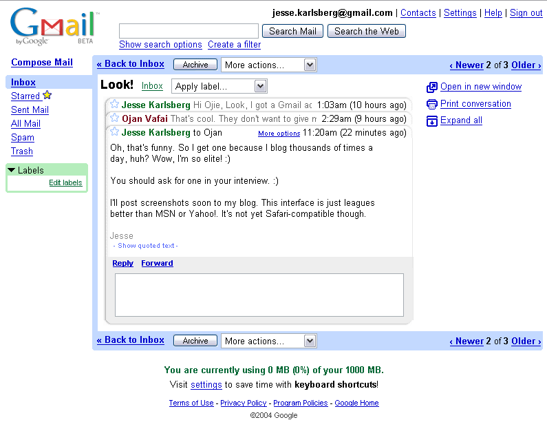
This is how Gmail displays a new message. The message I've chosen is a "conversation," or a threaded discussion over email. As you can see, in addition to viewing the message you've just received, you get an elegant interface presenting the previous messages in the discussion thread. In the default view, you get the first line or so of each email in the conversation, and, conveniently, the amount of time that has elapsed since each email was sent.
To the left of the email, you have several options. You can open the conversation in a new window, print it, or ... expand it.
The Gmail (beta) Conversation View, Expanded.
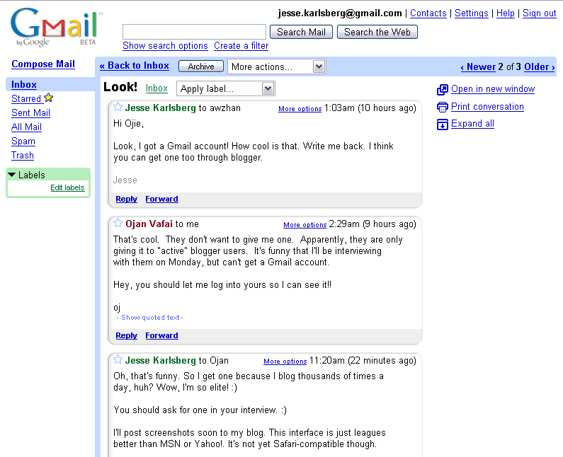
This does what you would expect it to do — display each email in the conversation fully expanded. This is a nice feature, and a very simple one, but is a much better inteface for handling email exchanges than the standard ">text text text" approach.
Replying or forwarding are both easy. At the bottom of the most recent email, you have a little reply field. Click on it, and it exands to a reduced version of ... the new message creation form.
The Gmail (beta) New Message Creation.
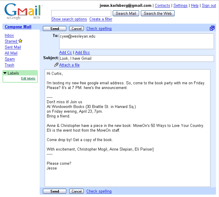
Click on "Compose Mail" and you get this screen. Google is obviously better using CSS and JavaScript than the competition. The new message box resizes along with your window, giving you just enough space in which to type. To the top right, an icon allows you to open the form in a new window. Otherwise, this is a simple, standard new message form, with the ability to add attachments, CC, BCC, etc.
The Gmail (beta) New Message Creation, Spell Checker.
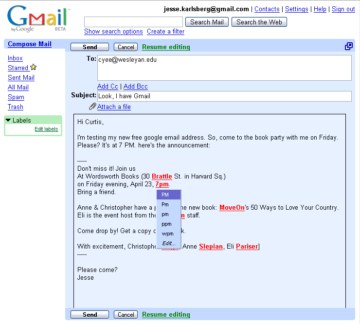
Gmail also gives you the option of spell checking. Again, the use of CSS and JavaScript is commendable. You get a nice div box with plausible replacements for your misspelt word at the tip of your mouse. This is way nicer than spell checking services offered by Yahoo!, Hotmail, IMP, even Blogger.
The Gmail (beta) Labels.
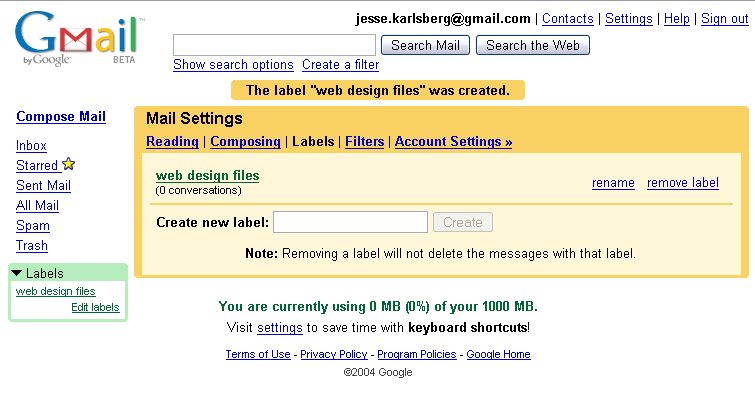
So, you can also add labels. With this and the search feature, Gmail sticks to their bright, Google-esque color scheme and simple interface. Even though Gmail does not give you folders, you can essentially mimic the functionality of folders through the use of labels. Your emails will all reside in your Inbox or Archive regardless, so unlike folders, which divide your emails, labels add an intersecting system of organization.
The Gmail (beta) Email Search.
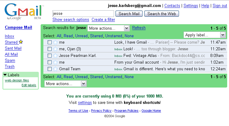
The ability to use Google search technology to find old emails is one of the most talked about features of Gmail (along with the use of AdSense technology and the 1 GB of free storage. Sadly, I haven't received too many messages just yet, so the search is not really of much use to me, but here you can see the interface and get a sense for how it works. As with the Inbox, in a very small amount of space, you get a lot of information about each message. You can see the place in the email where your search term came up, the email's location or label, its title, sender, etc.
So, that's my summary of Gmail. It's way easier to use, more functional, and just plain easier on a user's eyes than the competing services offered by Yahoo! and Microsoft. It's also faster, doing a lot of things through CSS and JavaScript where the competition loads new pages. So, head back to my blog and leave me a comment.